Exhibitors
- How to book a stall, step by step
- Venue details and floor plans
- Reasons to exhibit and advertising options
A complete event identity for a community-run exhibition, from logo and brochure to gate, banners and ads.
An exhibition has to win people over before anyone walks in. City Haat needed one recognisable look that worked everywhere it appeared — a brochure for exhibitors, banners for stall-holders, a gate at the venue, a Patrika ad, social posts and even a rickshaw sticker — and had to speak clearly to exhibitors, sponsors and visitors, in both English and Gujarati. It also had to feel festive and welcoming while still looking professional.
Brochure, banners, gate, ads, posts and even a rickshaw sticker.
Exhibitors, sponsors and visitors each had to be spoken to.
English and Gujarati had to sit side by side.
Every piece had to feel like the same event.
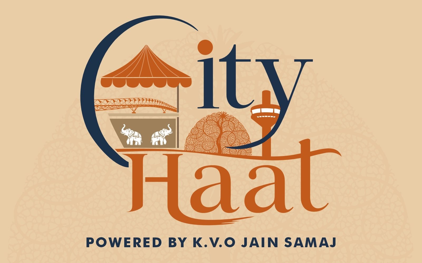
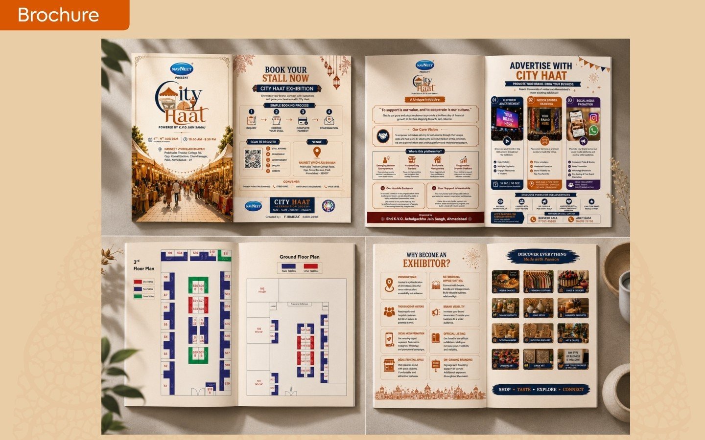
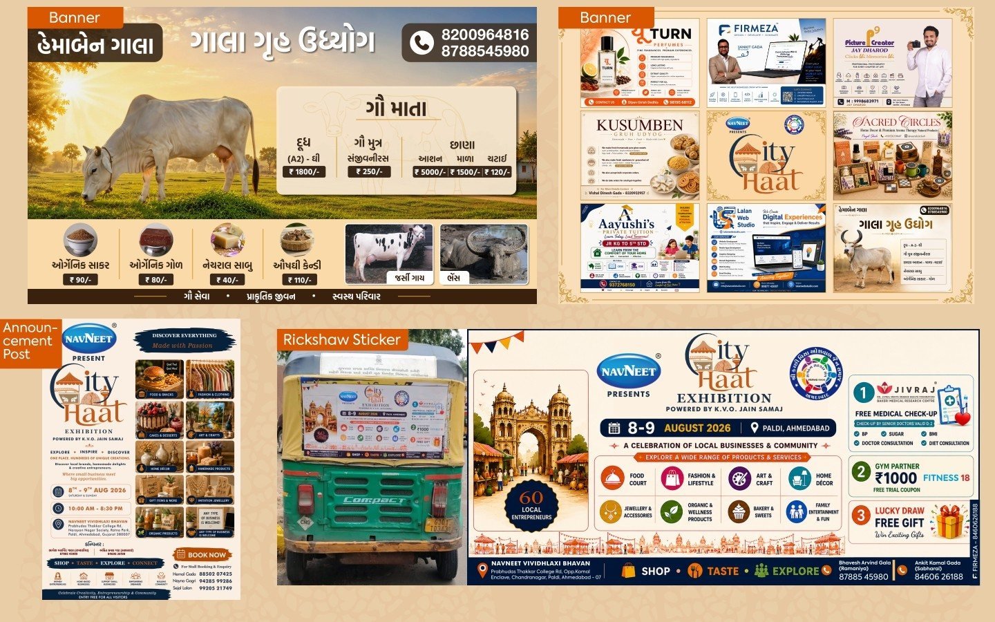
We started with the name and built the logo around it: “City” and “Haat” (a traditional market) set together as one mark, with a market canopy, city landmarks and a lattice-tree motif tucked into the lettering. A palette of deep navy and terracotta on warm sand gave the event a festive, heritage feel, and we carried it into every piece. The exhibitor brochure walks stall-holders through booking in four simple steps, then shows the venue, floor plans, reasons to exhibit and advertising options. The stall banners and announcement post reuse the same system in English and Gujarati, the front gate welcomes visitors with what they will find inside, and the Patrika ad introduces the event and its team to the wider community.
Tap any screen to view it full size.
A market canopy, city landmarks and lattice motifs in a warm palette.
A confident two-colour system carried across every piece.
English and Gujarati designed together, not added on.
City Haat is a two-day community exhibition powered by K.V.O. Jain Samaj in Ahmedabad (8–9 August 2026, Paldi, presented by Navneet). It brings around 60 local entrepreneurs together — food, fashion, art and crafts, home décor, jewellery, cakes, organic and handmade products — with a focus on supporting women entrepreneurs and home-grown businesses. We created its complete visual identity and the materials that carried it: the logo, an exhibitor brochure, stall banners, the front-gate design, an announcement post, a rickshaw sticker and a Patrika ad.
One recognisable identity across print, outdoor and digital
An exhibitor-ready brochure covering booking, venue, floor plans and advertising
Consistent English and Gujarati communication for the whole community
Outcomes reflect what was delivered; detailed metrics are shared with prospective clients on request.
Tell us what you’re planning. We’ll bring the strategy, design and engineering — starting with a free discovery call.
Next case study: Mummy nu Mum-Mum